- News
12 Deadly Landing Page Mistakes That All Businesses Should Avoid
Nowadays, most digital marketing campaigns have the website’s landing page as their prime focus with a strategy built around it. To gain new clients or to effectively communicate what your business has to offer, landing pages act as a bridge that leads the traffic to branch onto various targeted marketing strategies.
Despite the fact of vastly available tools and tactics to assist businesses, some common mistakes are unescapable. This phenomena-like situation is often encountered while building an outcome-oriented landing page.
Here are 12 dangerous landing page errors your business should avoid for optimum reach and result.
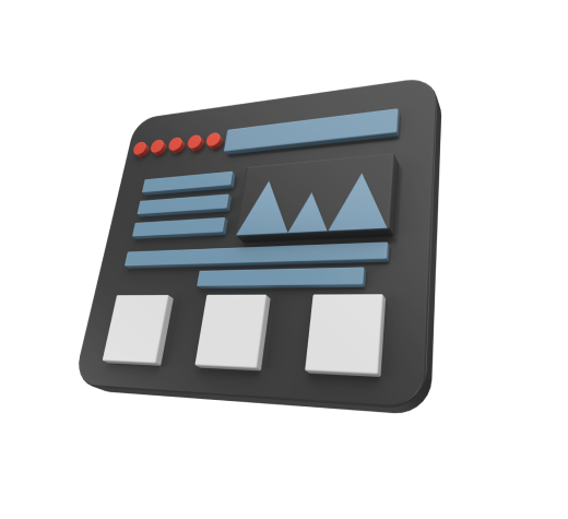
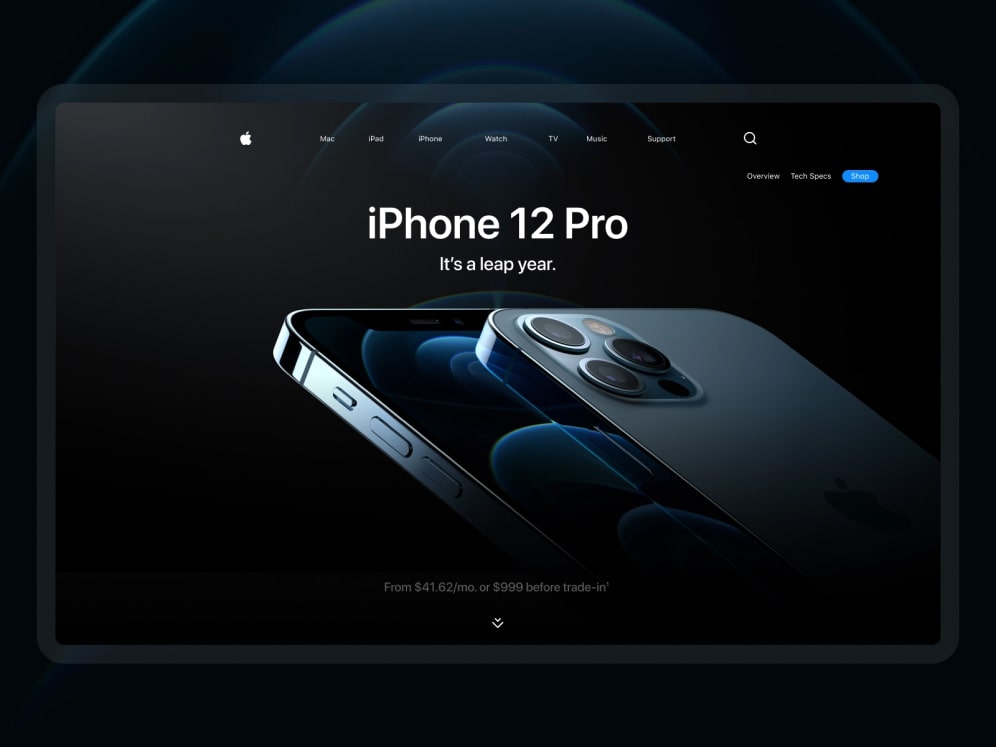
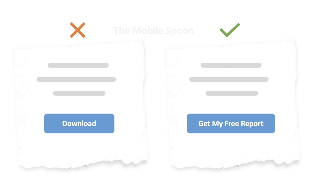
Your customers don't understand what you are offering
Let’s face it, the majority of internet users look for content that is valuable yet simple to absorb. A potential consumer will leave your landing page if it is unable to convey the message in 5 seconds.
Fundamentals for an excellent valuation of a successful Landing Page featuring Relevant Content:
- A Headline that highlights overall advantages in a concise and clear text
- The sub-headline that enhances precise information on the service/products offered
- Visuals that support your Value Proposition
As simple as it may appear, creating a value proposition is a challenging task.
It needs some preliminary work, such as competitor analysis, target audience research and creating a user persona; only then can you begin to create a strong and successful value proposition statement.
You can utilize the “grunt-test approach” to validate your value proposition, which is basically to show your website to a random person you meet for the first time in a coffee house. If this person with no prior knowledge of your business can understand what your business does in these few impressionable seconds – chances are your target audience will also understand it!
Get an unbiased opinion of someone who hasn’t likely encountered your value proposition, to respond to a few questions before you publish it:
- What appears to be the landing page’s offer?
- What benefit does it seem to provide?
- What action would the user be likely to take there?
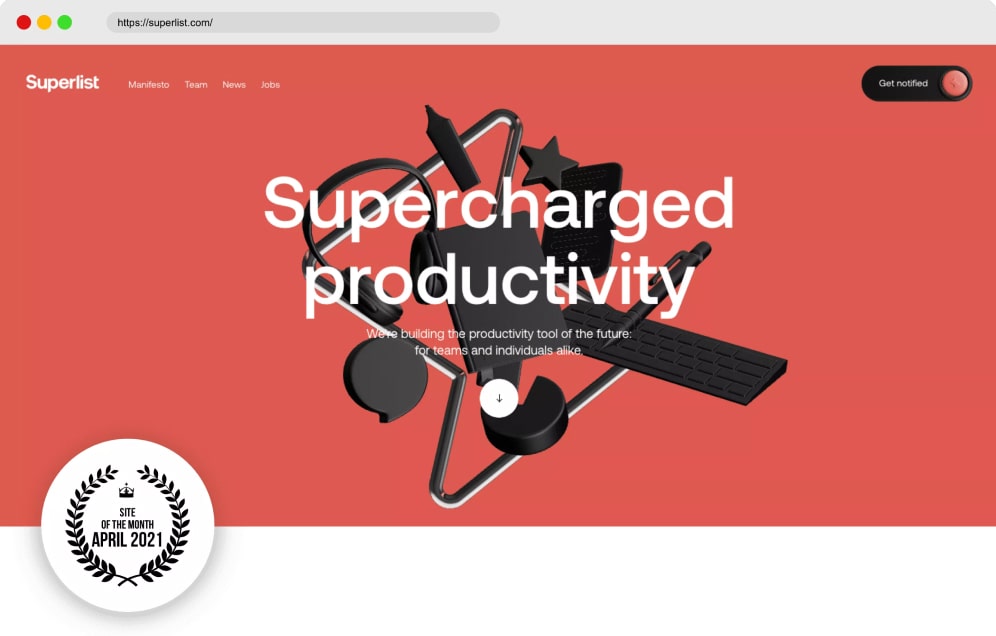
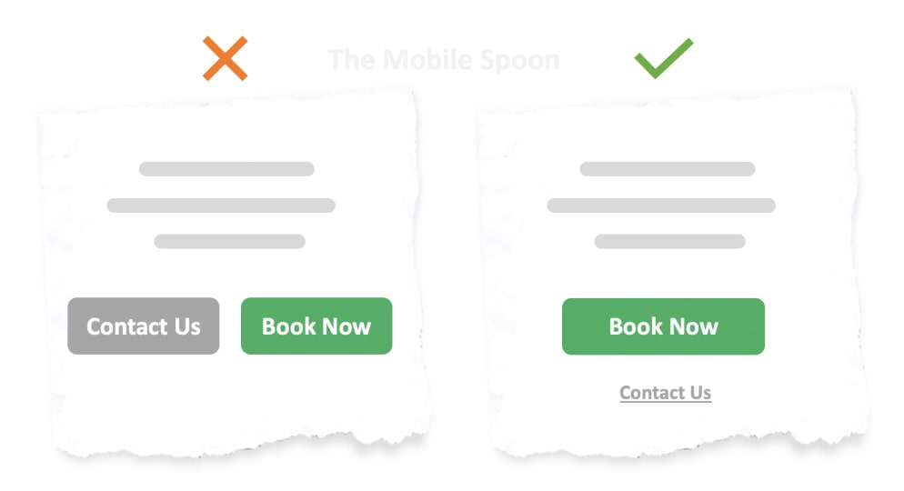
Your visitors are confused about what they should do
Customers should be aware of who you are and what you provide, but they should also be effortlessly directed towards what they must do next after arriving at your landing page.
It is essential to mention only the most significant features of your product or service on your landing page, showcasing what your customers will gain from working with you and how you can make it happen for them.
This is where call to action (CTA) is an important factor in the Conversion Triangle.
Things to Remember:
- There is greater tension and intensity on the website when the landing page items are positioned in a way that connect the gridlines
- The header and CTA should be placed at the intersection of the gridlines, in case the sign-up page is off-centre
- The main CTA can also be positioned closer to the page’s centre
- Don’t forget to enlarge it considerably compared to the other elements on the page
Studies show, that visitors pay closer attention to elements and fonts that stand out and are Effortlessly Visible.
Your landing page is taking far too long to load
Conversion Rates of your landing page are directly impacted by how quickly it loads.
Pages that take longer than two seconds to load, not only risk losing potential customers but also miss the opportunity of catching the attention of visitors.
Usually, increasing your website’s loading speed is a rather simple task to take on.
Google’s Page Speed Insights is a beneficial tool if you are unsure of how well-optimized is your landing page. It helps to unearth the components that cause longer load time.
3 Substantial Short Changes that Boost Loading Process:
- A Content Delivery Network (CDN) and distributed DNS to speed up the distribution of static content to website visitors, to reduce websites’ loading time
- Use image optimization to make your images lighter, hence shorter load time
- Free up server resources using a cloud storage service to store static information like images, data, etc.
You ONLY create landing pages for mobile devices
It’s necessary to keep in mind that, even though mobile subscribers outnumber those using traditional desktops; roughly 42% of your website’s traffic still comes from desktop visitors.
Therefore, don’t simply concentrate on designing a landing page that is compatible with mobile devices.
Bear in mind that folks who are viewing it via a traditional desktop computer may be looking for detailed information about your services.
You are not performing A/B testing on your landing pages
When it comes to developing a landing page that converts, there are no absolute guidelines. While a particular feature could be perfect for another company, it might drive away clients from yours.
This makes it crucial to conduct A/B testing for your landing pages.
Split Testing is the practice of developing various versions of a landing page and monitoring conversions for each, to increase the campaign’s overall effectiveness.
Various website features that are likely to attract visitors’ attention or encourage them to convert are changed as part of the process.
Absolute Split Test Elements Your Landing Page Needs
- Background Color
- Page Header
- Type of Offer
- Offer Content
- Text for Call to Action (CTA
- Copy of a Web Form
- Photographs/Visuals
It is not surprising that 60% of businesses think A/B testing is “very beneficial” for maximizing conversion rates.
In a survey, more than 70% of participants said that videos outperform other types of material in terms of generating conversions.
Therefore, the majority of marketers concur that videos are quite effective at increasing conversions.
Is this true for all websites?
Test your assumptions before making any sweeping statements about what would be productive for the people that visit YOUR website.
Redirecting ALL campaigns to ONE landing page?
Once you’ve narrowed down who your company is going after in the consumer market, it’s time to consider who exactly makes up that Target Demographic.
If you dig a bit deeper into consumer behaviour, you’ll discover how unique each member of the same target market is.
How do you then predict that they will convert on that very same landing page?
Here’s how!
Key Data Points that breakdown Your Target Market
- Interactions with your Brand or Sector
- What are THEY looking for
- Previous Purchase Triggers
Greater Conversion Rates = More Relevant Landing Page
Your landing page is lacking visuals
Researchers have found that 90% of the information that our brain processes are visual.
The brain processes visual information 60,000 times quicker than textual information.
If the value proposition of your landing page isn’t being successfully communicated, you should provide pictures that would do the deed.
Make it Simple
Any website visitor should be able to grasp what your business does and what value they will receive from it, whether it’s through product photographs, interactive graphics, how-to videos or brief gifs.
Your landing page asks for more devotion
It’s imperative to remember that not every visitor to your landing page is in the same stage of the sales cycle. While some people may be willing to give you their contact information and become customers, others might be simply interested and want a little more nurturing.
The conversion offered by the majority of landing sites requires a greater commitment from the user, which overwhelms them, at times causing them to leave.
Micro conversions such as a demo, a free trial without a credit card, a simple newsletter subscription or social media following, are a fine olive branch to begin with.
Of course, you must construct your business’s overall objectives and how these micro conversions fit into them.
Landing Page is “much too congested”
Offering micro conversions is necessary at times, but it is also critical that your landing page guides the visitor toward a single objective rather than overwhelming them with options.
The bad news is that several offers and call-to-actions are present on around 48% of landing sites. This complicates the landing page’s overall appearance and confuses the visitor.
Be Certain your Landing Page is concentrated on a Single Activity.
Remove any additional navigation or components that could direct a visitor to a different area of what your company has to offer.
This will indeed focus on the visitor’s ability to process that information with a clear intention.
Lacking trust factors
Similar goods and services are currently being provided by numerous companies in the online space.
Some new companies that went digitally live recently are in the thick of realizing and establishing a reputation with their target audience, while others have a symbolic industry experience.
As a customer, I don’t want to be connected with an unfinished product, under beta testing that gives little to no results and then some shallow promises. The majority of your website visitors won’t convert if they can’t identify any trust indicators.

Trust indicators or aspects are typically social verification of the services, products or benefits your company provides.
Include a few testimonials, be mentioned in well-known newspapers or have consumers submit their evaluations as a quick approach to valid these trust components.
Eventually, aiding your visitors in making speedier judgments.
No connection between ad and landing page
The disconnect between the copy of the webpage and the advertisement is often the most common and compelling reason for businesses to lose conversions on their landing pages.
To put it another way, promising your target audience something to attract them to your landing page and then providing them with an entirely different thing will only result in losing revenue.
The Means and the Message used to achieve your target audiences' interest, along with ideal utilization tools to convert them - Must Be Consistent
You lose the chance to even create leads when there is a lack of consistency between your website and ads.
Trying to dodge tracking or any analytical activity
It’s like putting on the appropriate eyewear when you properly set tags on your web pages, including your landing pages. If you don’t take this procedure seriously, you’ll never get the most accurate information on what’s truly happening on your page.
Accurate tracking facilitates quantifying your user’s journey to base your optimization.
If you are not skilled enough with monitoring concerns, it is recommended to seek outside assistance because proper tracking is much easier said than done.
Nevertheless, here are necessary pointers to help evaluate your progress:
Every platform often has its conversion monitoring tags, like Facebook Pixel or the Global Site Tag from Google
- Google Tag Manager embedded on each page of your website
- Your Google Analytics conversions and objectives are set up appropriately - Verify that Everything is Operational.
- Monitor all of the campaign and advertisement activities that direct users to your landing pages.
You lose the chance to even create leads when there is a lack of consistency between your website and ads.
Takeaway
Developing landing pages requires way more than just an attractive design.
They must be carefully planned based on information about your target market’s characteristics, their needs and the best ways to communicate your value proposition in correspondence to it.
A/B test your options before choosing one landing page for your marketing strategy.
We address such requirements all the time.
If you want a landing page that seamlessly connects you with your audiences, we can help you with your website, SEO strategy and more. Connect with us now.