- Blog, Design
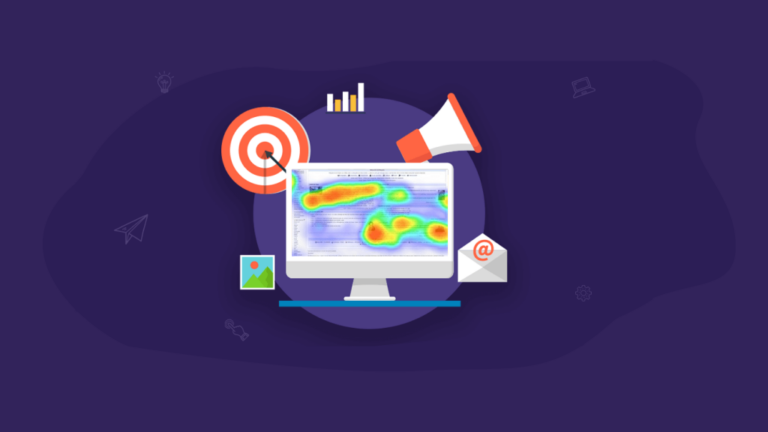
Optimize for Impact: Role of heatmaps and optimizations for UX design
- blog, SEO, UI/UX, Web Design
Heatmaps and optimizations for UX design! You might think this sounds about as exciting as watching paint dry, but trust me, it’s anything but boring. In fact, it’s kind of like a magic trick, where you get to make your website or app better and more user-friendly without even having to wave a wand.
Seeing is Believing! How Heatmaps Give You a Clear Picture of User Behavior on Your Site or App
So let’s start with heatmaps. Essentially, a heatmap is a visual representation of data that shows you where people are clicking, scrolling, and hovering on your website or app. It’s like a map of hotspots, showing you which areas are getting the most attention and which ones are being ignored.
By understanding how users are actually engaging with your site or app, you can make informed decisions about how to improve it. You can tweak the layout, adjust the wording, or move certain elements around to make them more prominent. And the best part? You don’t have to rely on guesswork or intuition – you can use hard data to back up your decisions.
Optimization - the devil is in the details!
But of course, it’s not just about gathering data – it’s also about using that data to make meaningful changes. And that’s where optimizations come in. Think of optimizations as little tweaks and adjustments that you make to your site or app based on the insights you’ve gleaned from your heatmaps (and other sources of data, like user feedback and A/B testing).
Tools
Ah, optimization tools – the secret weapons of UX designers everywhere! These tools are designed to help you take the insights you’ve gathered from your heatmaps and other sources of data, and turn them into actionable improvements to your website or app. Here are a few popular optimization tools to consider:
Hotjar
Hotjar like a spy gadget straight out of a James Bond movie, but for websites. You allow us to see into the minds of our website visitors like a digital Sherlock Holmes.
With Hotjar, you can watch your visitors’ every move, from their clicks to their scrolls to their hovers. It’s like having a crystal ball that shows you exactly what your visitors are thinking (or at least what they’re doing on your website).
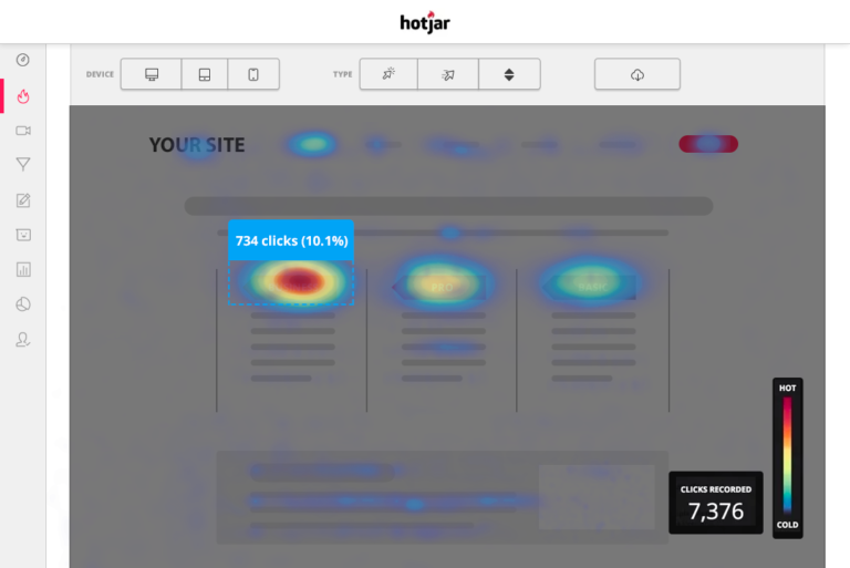
Hotjar lets you create surveys and polls to get feedback from your visitors. It’s like having a focus group at your fingertips, but without the awkward snacks and uncomfortable chairs.
And if that’s not enough to convince you, Hotjar also allows you to create fun quizzes to engage your audience. It’s like a game show where everyone wins (well, at least the people who answer correctly).
Crazy Egg
Crazy Egg is like a heat-seeking missile for your website. It shows you exactly where your visitors are clicking, where they’re not clicking, and where they’re getting stuck. It also has a nifty feature called “Confetti” that lets you see where your traffic is coming from, whether it’s from Google, social media, or somewhere else.
It’s like a treasure map that leads you straight to the pot of gold at the end of the rainbow (or in this case, the conversion you’ve been dreaming of).
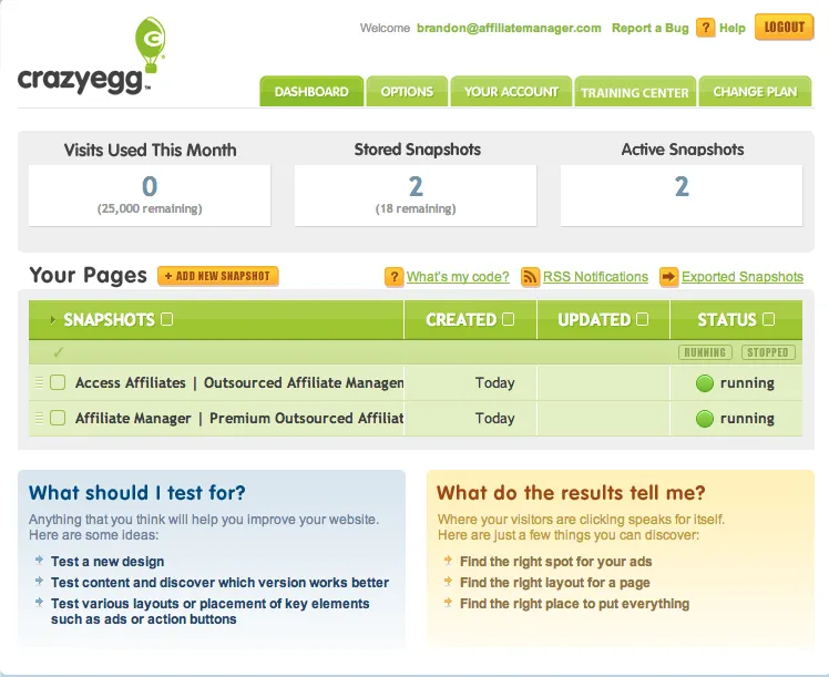
But wait, there’s more! Crazy Egg also has this nifty feature called “Confetti” that lets you see where your traffic is coming from. It’s like a colorful explosion of data that will make your inner geek squeal with delight.
Crazy Egg also has something called “Scrollmap,” which shows you how far down your visitors are scrolling on your page. It’s like a telescope into the depths of your visitors’ attention spans.
Smartlook
Smartlook is the cool kid on the block when it comes to website analytics. This tool is like a ninja, silently watching your website visitors and collecting valuable data without anyone even noticing.
Smartlook allows you to see exactly what your visitors are doing on your website, from their mouse movements to their clicks to their scrolling behavior. It’s like having a digital copycat, but one that you actually want to have around.
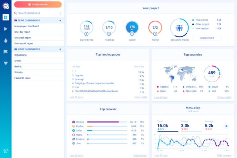
But wait, there’s more! Smartlook also has this awesome feature called “Funnel Analysis,” which allows you to track your visitors’ journeys from start to finish. It’s special feature called “Event Tracking,” lets you track specific actions that your visitors take on your website. It’s like having a detective on the case, uncovering clues to help you improve your website.
Matomo
Matomo is like having a whole toolbox of data at your fingertips, ready to fix any problem that comes your way.
Matomo allows you to track everything from page views to bounce rates to conversions. It’s like having a personal trainer for your website, helping you get in shape and perform at your best.
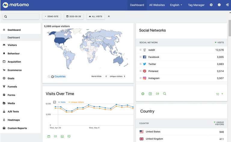
But wait, there’s more! Matomo also has this nifty feature called “Heatmap,” which allows you to see where your visitors are clicking and where they’re not. It’s like a hot and cold game of hide and seek, but with data instead of people.
Matomo also lets you create custom reports to track specific metrics that are important to your business. It’s like having a personal assistant who knows exactly what you need and when you need it.
The Bottom Line
With heatmaps and optimization tools, you can see exactly where your users are clicking, where they’re getting stuck, and where they’re getting confused. It’s like having an x-ray vision for your website or app. You can see through all the clutter and get straight to the heart of the problem.
So don’t be a blindfolded player. Embrace the power of heatmaps and optimization tools and watch your UX design skills soar to new heights!