


The Galvanizers Association (GA) is a leading authority on galvanised steel in the UK and Ireland, providing crucial insights, industry standards, and expert guidance for professionals across sectors. Being an authority on information, and with the wealth of its knowledge, GA felt that its website, where it hosted all this information, could use some work.
Catering to a diversified audience can be challenging. And this is exactly what they did. Galvanizer’s Association caters to the needs of architects, engineers, research interns, and fabricators. Our goal was to make this easy, modern, and intuitive – to give them the facelift they deserved.

Challenges of GA’s Outdated Website Design
Galvanizers Association (GA)’s previous website was an example of how an outdated design can hinder user experience. The website’s structure, content organization, and overall design were not optimised for today’s expectations of an intuitive and responsive user interaction.
An outdated design can hinder user experience, as the digital landscape has made so much advancements just in the last 5 years itself. So, with the old GA website, we wanted to press all the necessary buttons. The structure of the website, organization of content, branding guidelines, along with faster load times and mobile responsiveness.
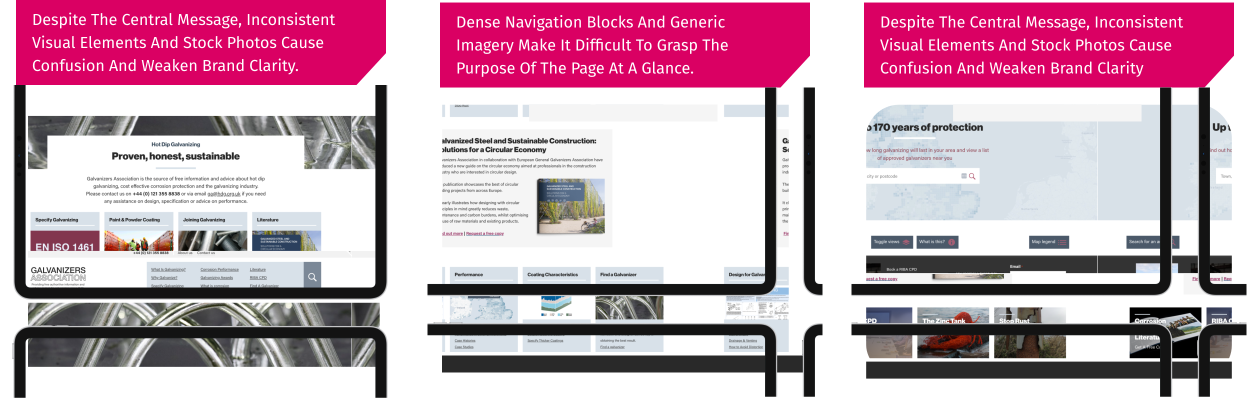
GA website was a content giant. And the content was all over the place. It had solid SEO built behind it, and we needed to take care of that without hindering it. So we followed the process, and we followed that to a dot. We took a crack at organising their information architecture and making sure we could give them the structure they needed.
Website Performance
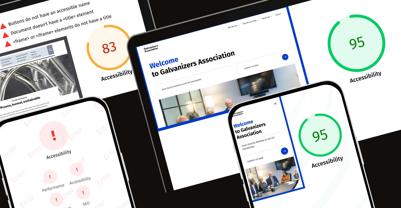
Low PageSpeed insights signalled to us that the old GA site was slow, which leads to user frustration, spike bounce rates, and hurt search rankings.

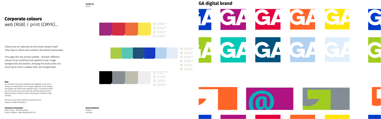
Letting Colours Guide Us
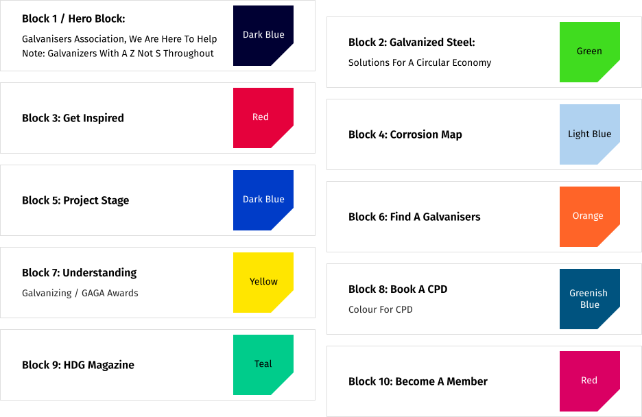
Our first job was categorisation. We knew that there were different types of users and all of them had various purposes to use the website. There were also different types of information which needed to be categorised under different sections, and should be made accessible to different users. This is what we tried to achieve with our categorisation discussions, and we decided to give it a twist by also adding some colour-coding elements. This made sure that this content mammoth stayed organized.

Suggested reading:
How Predictive Analytics in Marketing 2025 Enhances Personalization and Performance for Better Customer Engagement
Mapping the User Journey: From Categorization to Transformation
With the content meticulously organized and our new colour-coded categorization in place, our journey into reimagining GA’s digital presence truly began. This project was not merely a facelift but a complete transformation in how users interact with GA’s wealth of technical information. It was a journey that took us from a static, cluttered repository to an engaging, intuitive experience built around the real needs of its diverse audience.
Accessibility Score
A low accessibility score on both website and mobile indicated that GA’s content wasn’t easily usable by everyone. This could lead to low quality user experiences and reduced engagement. Improving accessibility features ensures inclusivity while enhancing overall usability and SEO.
Before diving into design iterations, we immersed ourselves in the world of GA’s users. We took upon to explore the needs of seasoned architects, structural engineers, fabricators, and even students—each with distinct challenges and goals on how GA aids them. Our mission was to understand not only what they needed but when they needed it. Behind every technical query lay a real-world project, a timeline of ideas evolving into tangible outcomes. These insights fueled our creative process and informed every design decision.
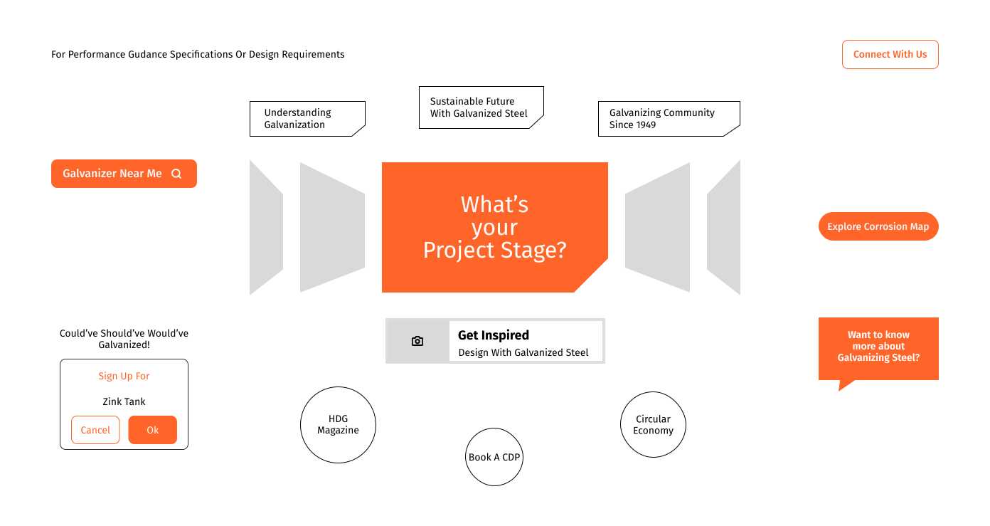
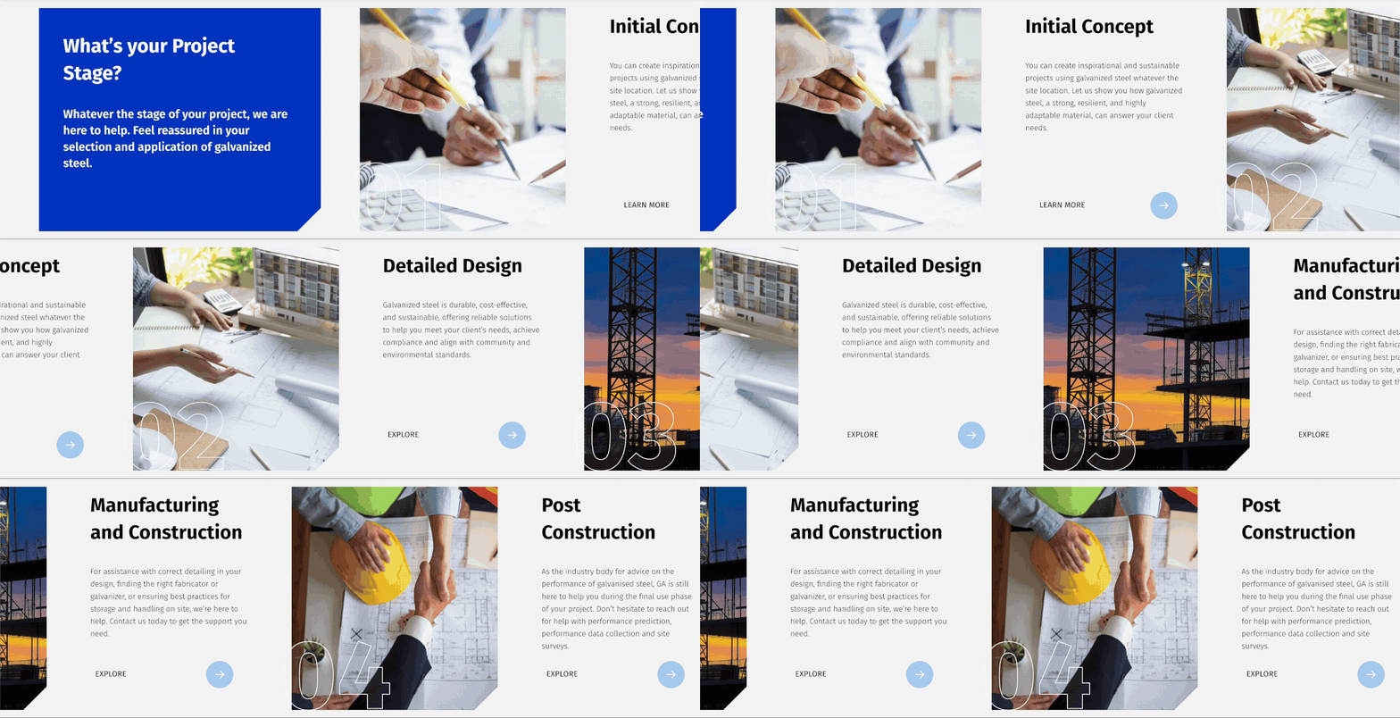
Our initial workshops were less about debating colour schemes and more about storytelling. We mapped the typical journey of a user: starting with a spark of inspiration, moving on to gather detailed technical data, and finally seeking practical guidance to execute their vision.
This narrative became the backbone of our strategy. Instead of presenting a disjointed array of content, we envisioned a digital space that acted as a guide—a path leading users from the moment they landed on the website to the exact information they required.
Are You Truly Understanding Your Users in 2025?
Leverage data-driven user research to uncover insights that shape better digital positioning, experiences, and strategies.
Enhance engagement, optimize decision-making, and stay ahead of evolving customer needs.
Collaboration was at the heart of this process. Brainstorming sessions evolved into collaborative prototyping, where wireframes transformed into interactive designs. Our design grew more refined and more attuned to the user’s journey. We experimented with dynamic navigation elements that adapted to a user’s current stage, ensuring that every click felt like a natural step forward.
Challenges arose along the way, particularly in balancing GA’s extensive technical content with a user-friendly layout. At times, the tension between maintaining technical depth and ensuring simplicity was palpable.
However, these hurdles only strengthened our resolve. We refined our approach, ensuring that the final design maintained the rich detail demanded by professionals while remaining accessible to newcomers. Every challenge became an opportunity to innovate and better align the digital experience with user expectations.
A pivotal moment in our journey was the realization that digital transformation is as much about purpose as it is about design. Every visual element—from the chosen colour palette to the layout—was selected not only for aesthetic appeal but for its ability to guide and reassure the user. The colours served as subtle signposts, directing visitors to the content they needed while reinforcing GA’s trusted brand identity.
When the revamped website finally launched, the transformation was striking. What was once an overwhelming sea of information had evolved into a clear, navigable journey that welcomed every visitor and guided them through GA’s extensive expertise with ease.
The experience was more than functional; it was narrative-driven, inviting users to follow a path tailored to their unique project needs.
Our work with GA exemplifies how a journey-focused approach can redefine digital experiences. By aligning design with real-world user journeys, we transformed a cluttered interface into a dynamic and engaging resource.
This project is a reminder that behind every digital interface is a story waiting to be told—a story of progress, collaboration, and the relentless pursuit of better user experiences.
Cause and Effect: Revolutionizing B2B Website Optimization
Lessons from GA’s Website Redesign
Our work with GA was more than a facelift—it transformed a cluttered archive into an engaging, intuitive experience. By centring our design on user needs and using strategic colour cues, we reshaped content and navigation into a journey that tells a clear story with every click.
This project shows that when design meets purpose, every element guides users effortlessly. For any B2B organization struggling with a content-heavy website, modern, user-centric design isn’t just an upgrade—it’s a catalyst for deeper engagement and industry leadership.
Welcome to the new Galvanizers Association—a powerful example of how thoughtful design can turn challenges into a journey of discovery and success.
Ensure your website is more than just functional—let’s make it optimized to deliver seamless, engaging experiences that establish trust.