- Blog
Responsive Web Design Tips: Boost Your Site’s Flexibility
Have you ever stumbled upon a website that looked like a hot mess on your phone? Are you tired of websites that look like they were designed for an ant-sized screen or websites that require you to play a game of ‘Where’s Waldo’ to find the navigation menu on your phone? In this blog, we’ll explore some tips and tricks for making your website look fabulous on any device, from a laptop to a smartwatch. So, grab your magnifying glass, sharpen your fingernails for some pinch and zoom action, and let’s dive into the world of responsive web design!
What is responsive web design?
The control which designers know in the print medium and often desire in the web medium is simply a function of the limitation of the printed page. We should embrace that the web doesn’t have the same constraints and design for this flexibility. But first, we must ‘accept the ebb and flow of things.’
John Allsopp, “A Dao of Web Design”
You know when you’re browsing the web on your phone and you come across a website that looks like it was designed for a dinosaur-sized screen? You have to zoom in and out, scroll sideways, and squint your eyes to read the tiny text. It’s frustrating, right? Well, that’s where responsive web design comes to the rescue!
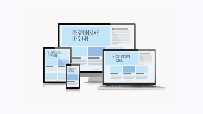
Responsive web design is a design approach that ensures your website looks great and functions well on any device, from a tiny phone screen to a giant desktop monitor. With responsive design, your website will adapt and adjust its layout, font sizes, and images based on the screen size and orientation of the device. So whether your users are browsing on their phone, tablet, or desktop, they’ll have a seamless and enjoyable experience.
Think of it like a chameleon that changes its colors to blend in with its surroundings. Responsive web design is all about adapting to the environment and making sure your website looks and works its best, no matter where your users are browsing from.
Why is responsive design important?
Yes! It is the abundance of gadgets (especially mobile/handheld ones) on the market that makes it increasingly important. Click here to get started with mobile friendly websites.
Actually, responsive web design is all about altering the size of the web page to fit the viewport (or screen size) on which it is being viewed. In today’s digital world, responsive site design is crucial!
When evaluating a website’s responsiveness quotient, the following questions must be taken into consideration:
Is the font size readable?
Am I getting any horizontal scroll on the web page?
Does adequate space separate my elements?
Do my users have to pinch for zooming into the content?
The following are some key examples that emphasize the significance of flexible web design:
Explosive mobile growth
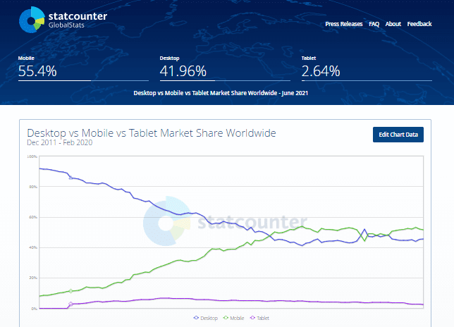
We live in a world where mobile devices are ubiquitous. 3.6 billion people of the world’s estimated 7.8 billion population are smartphone owners. There are 3.6 billion users who could visit your website using a smartphone.
Need for high speed
Imagine, there are more than a billion websites accessible worldwide. As a business owner, there is a good chance that another company has already made use of the uniqueness of your idea.
Therefore, it is crucial for a business owner to tell web developers to customize the website for their target market and audience. Page load time is also crucial because a person quits a website within two seconds.
Better search indexing
Google released the mobile-friendly update on April 21, 2015, emphasizing the need for mobile-friendly pages to achieve higher search engine rankings. Websites that adhere to best practice, such as having text that can be read without tapping (or zooming), improving the spacing between tap targets, etc., stand a greater chance of ranking than their equivalents.
Tips for responsive web design
Fluid Grid
Have you heard of the fluid grid design concept? It’s a pretty cool way of creating website layouts that adapt automatically to the screen’s width.
Basically, instead of designing a website with fixed-width columns, a fluid grid breaks the layout into flexible columns that adjust according to the screen size. This makes the overall design clean and consistent, and it allows the website to scale seamlessly across different devices without the user having to constantly scroll down.
So whether you’re viewing the website on a desktop, a tablet, or a mobile phone, the fluid grid ensures that the website looks great and is easy to navigate. It’s a relatively new concept, but it’s quickly gaining popularity among web designers because of its flexibility and responsiveness.
Flexible layouts
Did you know that creating flexible website layouts with CSS is not as complicated as it may sound? In fact, you can use a few straightforward techniques that can make your website look fantastic on any screen size!
Here are some tips that can help you create flexible layouts with CSS:
You can use media queries to modify the layout according to the screen size.
Instead of using fixed pixel values, use percentages or ems for widths. This will ensure that your layout is flexible and adjusts itself to different screen sizes.
Make your content modular so that it can easily reorganize itself when displayed on different screen sizes.
Lastly, you can use a responsive grid system to arrange your content in an organized and visually appealing way.
Flexible grids
Here are a few things to keep in mind when using flexible grids. Firstly, you want to make sure that your grid is genuinely fluid, meaning it can resize itself based on the screen size or window it’s being viewed on.
Secondly, it’s essential to ensure that all your columns are of the same width. You can achieve this by using percentages or ems instead of pixels, which gives your layout the flexibility to adjust to different screen sizes.
Lastly, it’s important to make sure that your content flows smoothly from one column to the next. One way to achieve this is by using media queries to switch up the order of your content on different screen sizes.
By following these tips, you’ll be able to create a responsive website that looks great on any device!
Media queries
They’re super important because they allow designers to modify the CSS style rules on a webpage based on the characteristics of the device being used to view it. This way, the webpage always looks great, whether viewed on a desktop computer, tablet, or smartphone.
There are three types of media queries you can use to make different CSS style changes. The first targets specific devices, the second targets specific screen sizes, and the third targets specific orientations. For example, a media query targeting smartphones might be used to make the font size larger and ensure buttons are easy to tap.
It’s important to keep in mind that when using media queries, you need to test your web pages on as many different devices as possible. This way, you can ensure that your pages look and work correctly, no matter what device they’re viewed on.
Optimized loading times
To maximize the visual appeal of your website, it’s essential to optimize images for the layouts they’re viewed on. This prevents scaling and bandwidth issues. The best file formats to use are JPEG, GIF, and PNG-8. Other formats like PNG can make image sizes up to 10 times larger, which can slow down the loading time. Using the right file formats can also help preserve the quality of your images.
Apart from images, having a responsive design also makes reading content easy for your visitors. You can achieve this with clean typography that’s easy on the eyes. By keeping these things in mind, your website will look great, and visitors will have a great experience, no matter what device they’re using!
Conclusion
Remember, when it comes to web design, size really does matter. That’s why a responsive design is crucial to ensure that your website looks good on screens big and small. We wouldn’t want any of your visitors squinting at their screens or getting lost in a sea of endless scrolling, now would we?
So, if you haven’t jumped on the responsive web design bandwagon yet, what are you waiting for? It’s time to make sure your website looks amazing everywhere, from the tiniest phone screen to the biggest desktop monitor. Trust us, your visitors will thank you, and your website will be the talk of the town (or at least the internet).